Websites for consultants that earn trust before anyone gets in touch.
When someone's choosing a consultant, they're deciding whether to trust you with something that matters to them. Your website is the first thing they judge that on. A clear, considered site earns that trust. A generic or dated one quietly loses it.
Consultants are chosen on trust, and trust starts with how you look online.
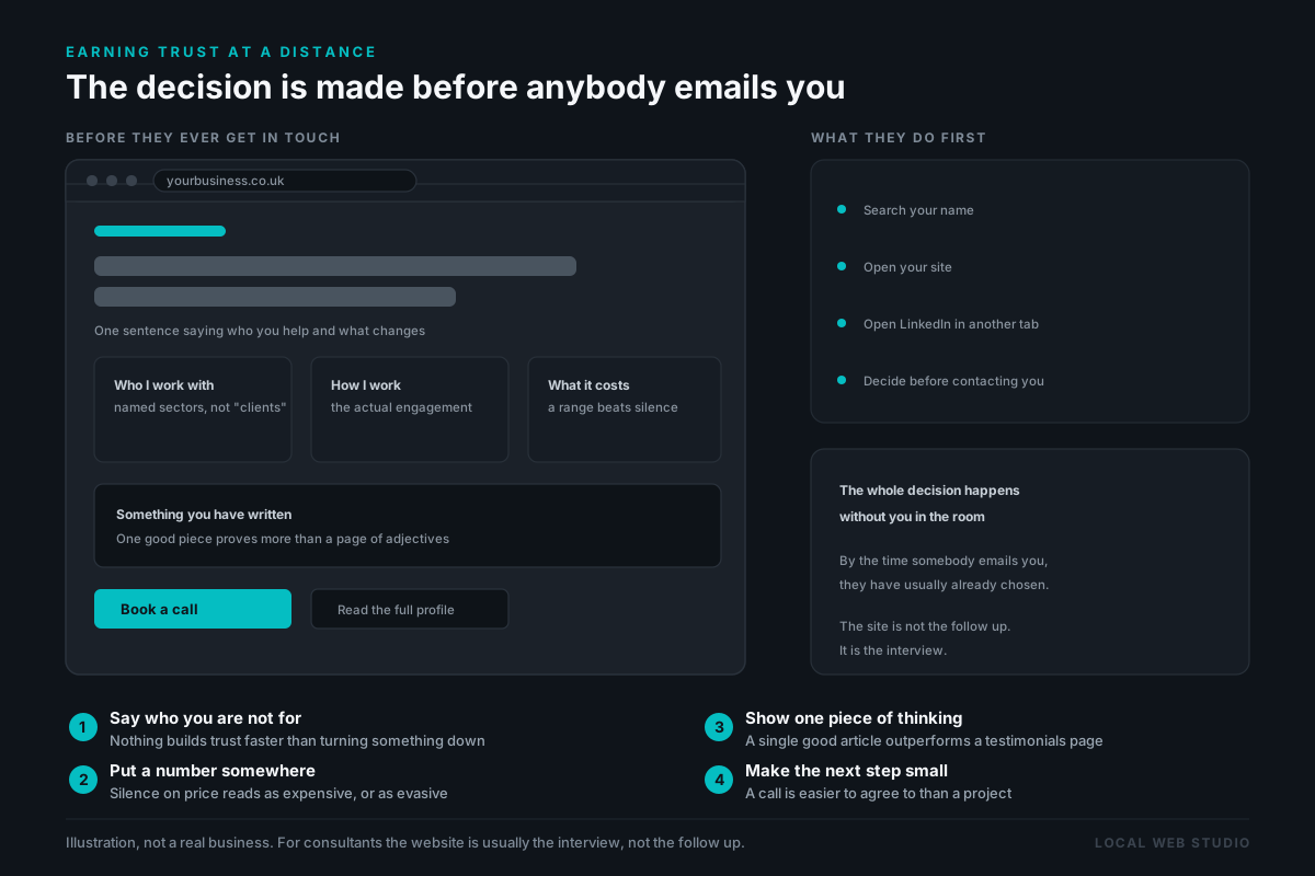
People rarely pick a consultant on price. They pick the one who seems most credible, most established, most likely to actually help. Long before they get in touch, they look you up, and your website is the first real impression you make. If it's thin, dated, or looks like a template anyone could have, it undercuts the expertise you've spent years building. The work might be excellent. The site has to say so too.
A template can't carry your credibility.
A cheap template gives you the same layout as every other consultant, which is the opposite of what you need when the whole point is being the credible choice. A DIY builder usually ends up looking like exactly that. And an agency will charge a premium and still not take the time to understand what you actually do. None of them give you a site that feels considered, professional and unmistakably yours.
Being sized up online before anyone makes contact is not a consultancy problem, either. It happens to every business that gets picked out of a search, and what follows here is only what changes when the thing being judged is your thinking. The wider version of that argument is on my page about web design for tradesmen
What I build for a consultancy.
Clarity about what you do.Your services explained simply and confidently, so the right people immediately understand you can help them.
A credible, professional feel.A calm, considered design that reflects the standard of your work and earns trust from the first visit.
Your experience, presented properly.Your background, qualifications and approach given the weight they deserve, not buried.
Found by the people who need you.Set up so you show up when someone searches for the kind of help you offer, locally or further afield.
A consultancy I did exactly this for.
SEND Guidance is an education consultancy helping parents and schools navigate the SEND system, with people often reaching out at a stressful time. It needed a site that felt clear, professional and trustworthy from the first visit. I built one that explains the service properly for the different people who rely on it, and gives a new consultancy a credible foundation to grow from.
“Danny created a website that feels clear, professional and trustworthy, which was exactly what I wanted. He understood the tone I was aiming for and turned it into something that presents the service properly and gives people confidence from the first visit.”
Common questions
Have a question not listed here? Call or text Danny and you'll get a straight answer.
Get in touchA consultant has no finished job to point at.
A roofer can send a photograph of the roof. What you sell is judgement, and judgement does not photograph. So in the weeks somebody spends deciding, and it is usually weeks, all they have to go on is how clearly you have set out your thinking, your background and the problems you actually solve. The site has to make that case while you are not in the room, because by the time you are in the room the decision is largely made. SEND Guidance needed exactly that from a standing start, and the full story of how it was built is worth a read. If your practice is in the same position, I will design your homepage and send it over before there is anything to agree to. Asking a consultant to buy on a description alone would be a poor way to make the argument.
Last updated: